


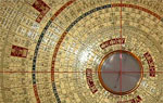
Feng Shui
The unique quality of Chue Style Feng Shui comes in the fact that its principles of Feng Shui are not to be found anywhere in books.
The Chue knowledge and indeed secrets have only been passed first hand from Master to Master through the Imperial Courts of China. Chue prides itself in the fact that it respects and follows the laws of nature and the characteristics of Yin and Yang in order to guide this powerful energy into your premises.
There is nothing more powerful than nature.
Chue Style specialises in two disciplines in the field:
Form School Feng Shui

Compass School Feng Shui
To both of theses disciplines Life Force Energy is key.
The Principle
Ensuring your building is receiving a good source of Life Force Energy is of paramount importance to the occupants within.
70% of our focus on a consultation is based on the exterior of your building and ensuring a good quality of energy arrives at your premises.
Every building has a directional flow to its energy. If this only flows one way then your money will come in but leave again just as quickly.
Feng Shui to a building is what acupuncture is to the body. Ensure there are no blockages in the meridians of your premises.
Absenteeism in the workplace costs an employer over £500 per missed day according the CBI. Sick Building Syndrome can be the root cause of an unhappy workforce. Address the energy of your building and ensure productivity for your business.
The main door is the mouth of the building through which the nourishment flows and needs to be kept healthy. Be sure to take the advice of your Feng Shui hygienist

This is Chue Style Feng Shui - working with nature
Feng Shui Consultations
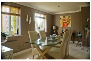
Is the energy flowing around your home enough to sustain the family?
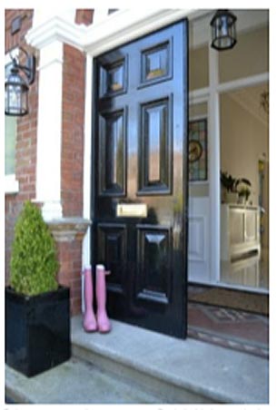
Size matters when it comes to your front door. The energy must be able to find you.
Every building has a directional flow to its energy. If this only flows one way then your money will come in but leave again just as quickly.
Feng Shui to a building is what acupuncture is to the body. Ensure there are no blockages in the meridians of your premises.
Absenteeism in the workplace costs an employer over £500 per missed day according the CBI. Sick Building Syndrome can be the root cause of an unhappy workforce. Address the energy of your building and ensure productivity for your business.
70% of our focus on a consultation is based on the exterior of your building and ensuring a good quality of energy arrives at your premises.
The main door is the mouth of the building through which the nourishment flows and needs to be kept healthy.
Troubles with health, wealth or relationships?
"We knew very little about Feng Shui but... Kay was very professional and thorough at our first meeting when she explained how the Feng Shui system worked."
A Feng Shui consultation may help you too.
Read real life stories & testimonials from clients
Contact kay@theenergyspecialist.co.uk if you'd like to explore the opportunities that feng shui can bring to your property.